- A can of worms!
- A sensation
- The stimulation of the eye's retina
CSE3325: Colour
In the previous lecture:
In this lecture:
|
| What is colour?
|
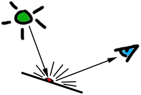
The wavelength of light hitting the retina determines the cones (structures in the eye responsible for colour vision) which will be stimulated and the messages which will be sent to the brain.
|
All materials contain pigments which
|
 |
Paints & dyes are pigments in convenient, human useable form!
|
Subtractive Primary colours are the basis for all other colours. (What primary colours are used for printing purposes?)
|
Secondary colours are constructed by combining equal proportions of primary colour.
|
Subtractive - pigments filter out light of different wavelengths from white light, leaving coloured light to be detected by our retina.
Eg. A white page of paper appears (and is called) white because it is reflecting all wavelengths of visible light incident upon it.
If one were to apply blue ink to a white page, light hitting it would be filtered by the pigment in the ink (which only transmits blue light). This blue light would hit the white page, be reflected back through the ink (where it is filtered again) and may hit a person's retina. That person may well exclaim "Blue!".
What primary colours are used in printing on white paper? (Inspect a colour newspaper with a magnifying glass to find out.)
|
Colour Wheel - a diagramatic representation of the relationships between colours. The primary colours form the verteces of a triangle around the circumference of the wheel. Secondary colours fit between these, tertiary colours flesh out the circumference to any resolution you please. |
 |
Intermediate colours are constructed by combining two primaries in
a ratio of 2:1.
(These colours lie between the primary and secondary colours
on a colour wheel)
Tertiary colours are combinations of the primary colours in any other proportion.
Tints & Shades are series of colours obtained by adding white (for tints) or black (for shades) to a colour obtained above.
If you really want to understand what these terms mean, there is no substitute for buying some white, black, red, blue and yellow paint and some white paper... get your fingers dirty. (Take my word for it, this will give you a better understanding of colour than learning these notes ever will!)
|
Additive Primary colours
|
Additive Secondary colours
|
Additive colours may be specified by giving intesity values for each of the Red, Green and Blue components at a single pixel.
Additive colour specification in HTML
R, G, B each specified by hexadecimal pair (RRGGBB).
Each pair may range from 00 (off) to ff (fully on).
Specify basic
colours by name
(These will be interpreted by the browser - check
the HTML source for the preceding sentence!)
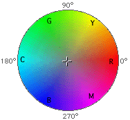
Here's a colour wheel for the additive system.
The primary colours still form a triangle, the secondaries fit between these, and the tertiary colours flesh out the circle.
|
Hue is the 'colour' of a colour, e.g. that which allows you to identify it as a 'blue' or a 'red'. |
|
|
Saturation is the '-ness' of a colour, for example its 'blueness' or 'redness', also loosely called intensity. (A more saturated red is a more intense red) |
|
|
Value is the amount of light or dark in a colour. Sometimes called 'Brightness'. |
Groups of colours relate differently to one another depending on their properties.
|
Discordant colours 'jar'. |
What colour is a...
Would you step on a grey bee? |
Have you ever seen a black and yellow elephant?
|
|
Harmonious colours 'relax'. (Especially if they are not highly saturated) Imagine a dentist's waiting room painted black and yellow! |
|
Colour relationships can be used to encourage a viewer to feel uneasy or at
ease, comfortable, disoriented or cramped.
|
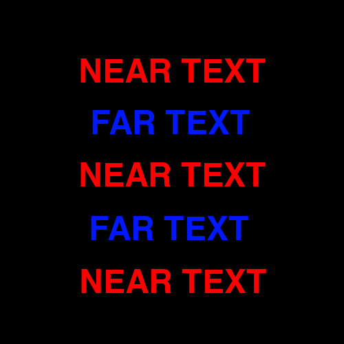
Warm hues (yellow <-> red) encourage viewers to feel heat or warmth. |
|
|
Warm hues move forward in a composition. |
|
|
Cool hues (blue <-> green) encourage a cold or cool feeling. |
|
|
Cool hues sit backward in a composition. |
|
Here is an excellent illustration of colour depth effects... |
 |
 |
Colours can look energetic and busy, or calm and easy going. |
 |
Colours have culture-specific meanings
|
Love,
passion, heat, flame, feminine power
|
|
Fertility,
peace, nature, Earth
|
|
Truth,
clarity, dignity, power
|
|
Energy,
joy, lightness of being
|
|
Royalty,
wealth, sophistication
|
|
Masculinity,
stability
|
|
Death,
rebellion, darkness, elegance
|
|
Lightness,
purity, cleanliness, emptiness
|
Colours may be associated with people and professions (often through
trade clothing)
|
Spanish
dancers, bull fighters?
|
|
Soldiers,
tram conductors
|
|
Police,
sailors, blue collar workers
|
|
Bananas
in Pyjamas?
|
|
Clergy
members, Suffragettes
|
|
School
teachers?
|
|
Goths,
motorcycle riders, artists, heavy metal heads
|
|
Doctors,
chemists, dentists, white collar workers, virgins
|
There are many other considerations in choosing colour for your displays. NASA has an interesting website on this very topic.
Different computers have different
Hence colours ain't colours!
|
TIP: To obtain web-safe colours when using hexadecimal colour specification, only use the following colour component values: 00, 33, 66, 99, CC, FF Here is the web-safe palette you can obtain using these colours...
|
CSE3325 courseware | CSE3325 lecture notes
![]()
©Copyright Alan Dorin 2005
