Comparison of different signage systems.
 |
 |
 |
CSE3325: Lecture 6 – Information Design
In the previous lecture:
In this lecture:
References:
What is Information Design?
Presenting information about motion, process, mechanism, cause and effect.
How do we present information in a way that:
Clarity and Excellence in thinking = Clarity and Excellence in Data
Graphics reveal data.
Some examples:
Graphing Data
The use of abstract, non-representational pictures to show numbers (statistical graphs invented around 1750-1800).
Graphs allow us to reason about quantitative data. (They can also be misused.)
An excellent chart by Minard (1869) shows the relationship between the size of Napoleon's army as it marched on Russia in 1812, the obstacles it was forced to overcome and the times, places and success with which these obstacles were met.
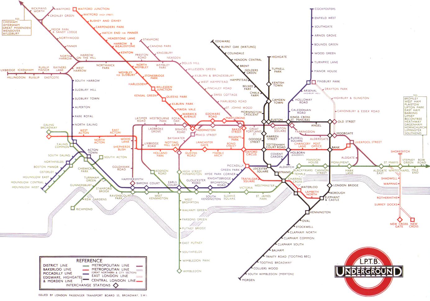
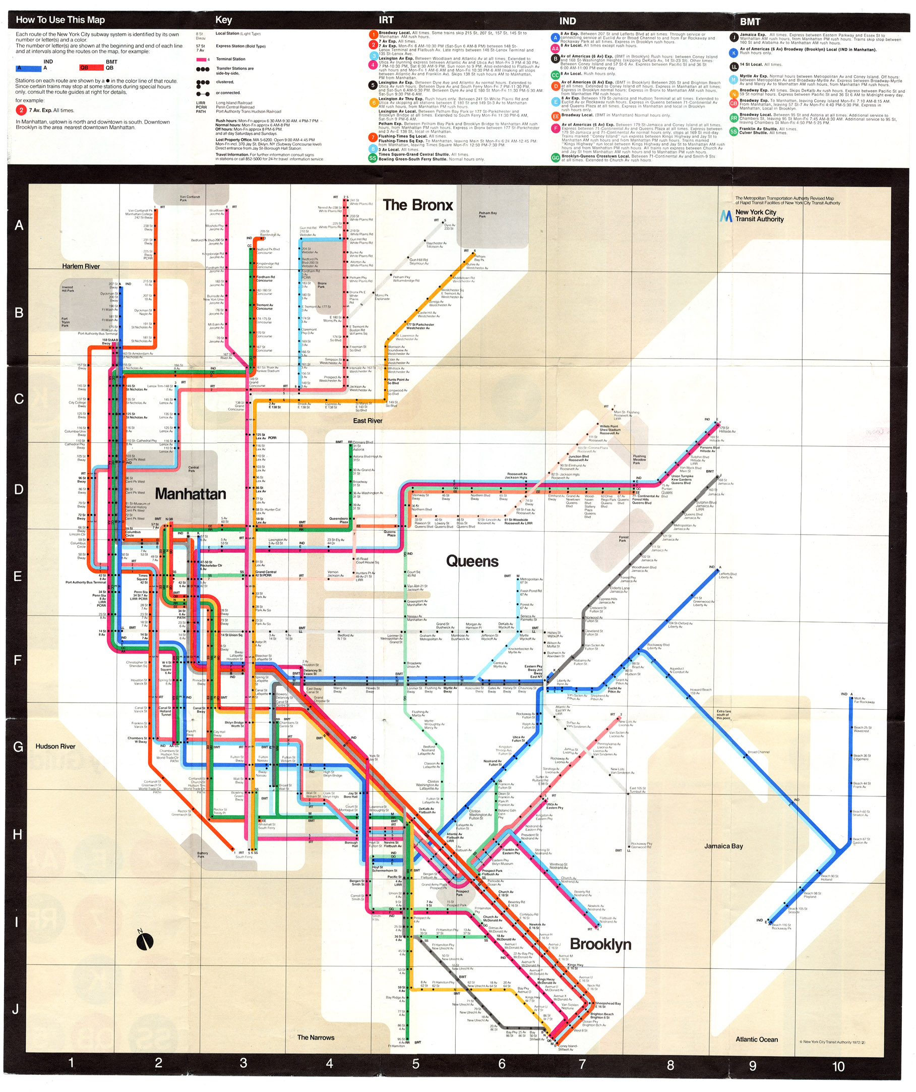
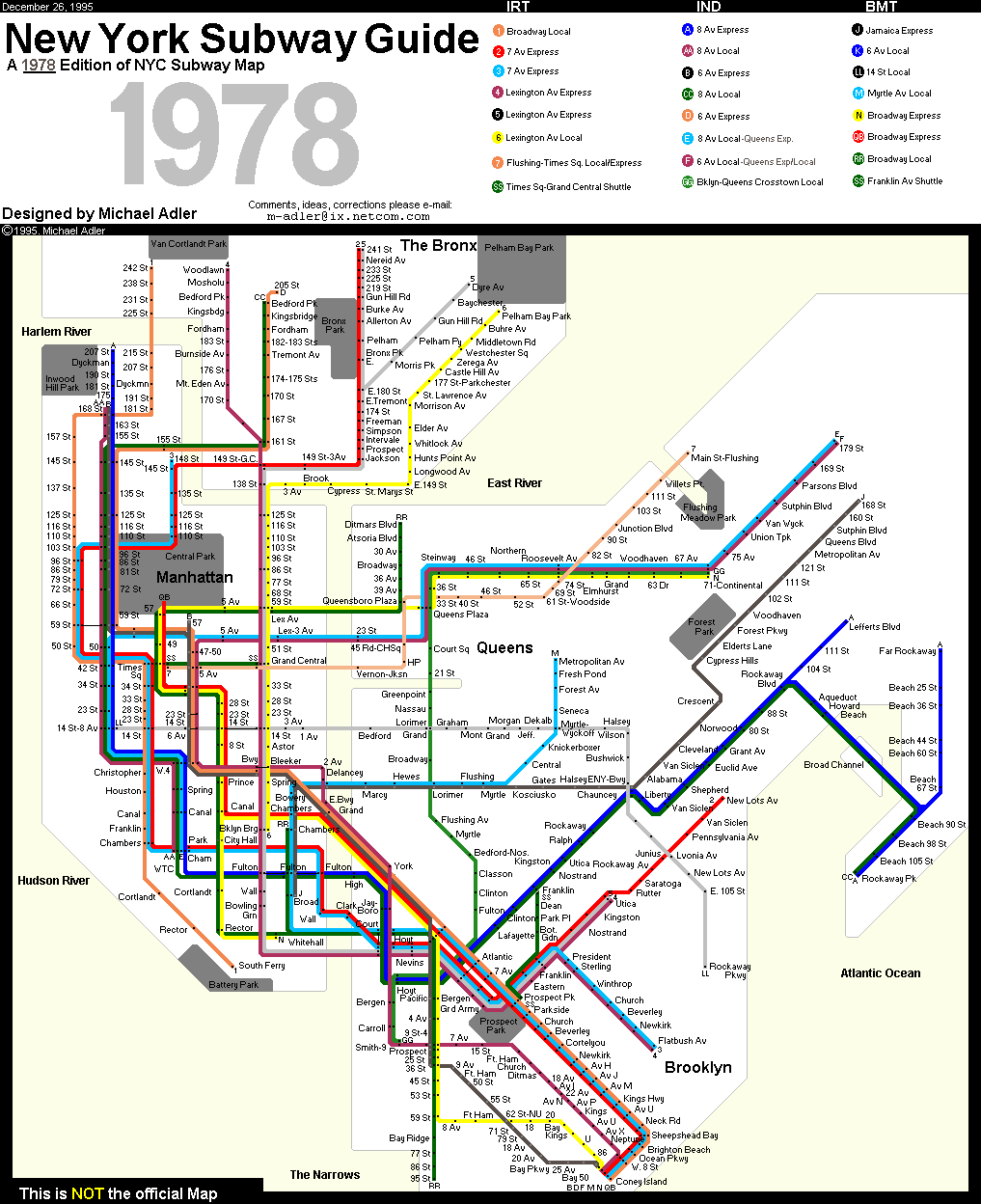
Transport Maps
London Underground map, designed by Harry Beck in 1933 achieves a reduction of complexity through:
- simplified geometry and topology
- a focus on connections rather than geographic accuracy (users are interested in the sequences of stops rather than the precise direction of travel or distance between stations)
Too much reduction makes the representation too abstract and reduces understandability.
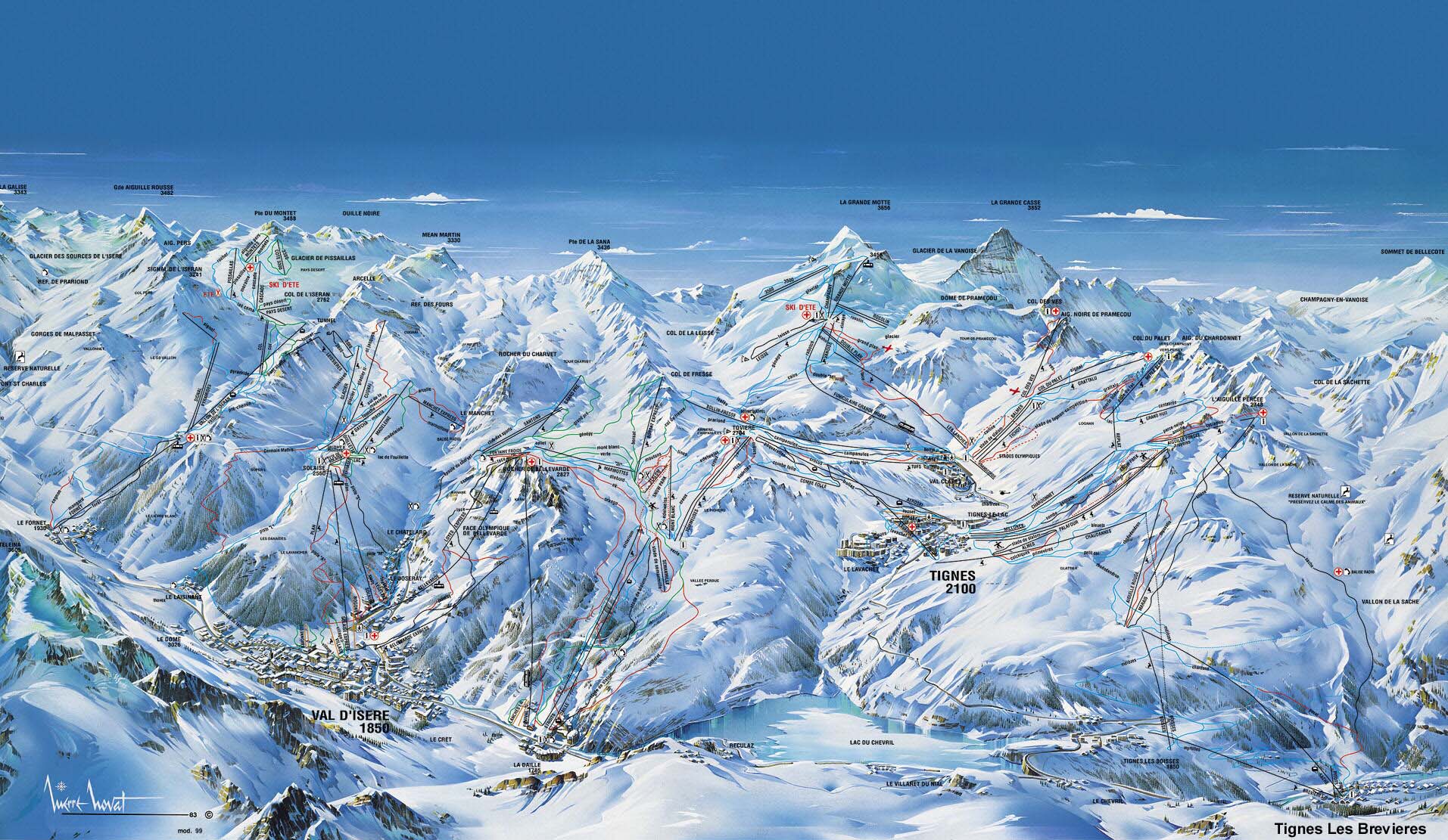
Of course mapping is a fantastic information display mode in many contexts!
- French Piste Map
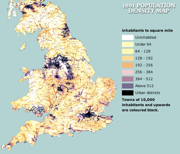
- UK Census map
- Snow's famous map of the Cholera Epidemic
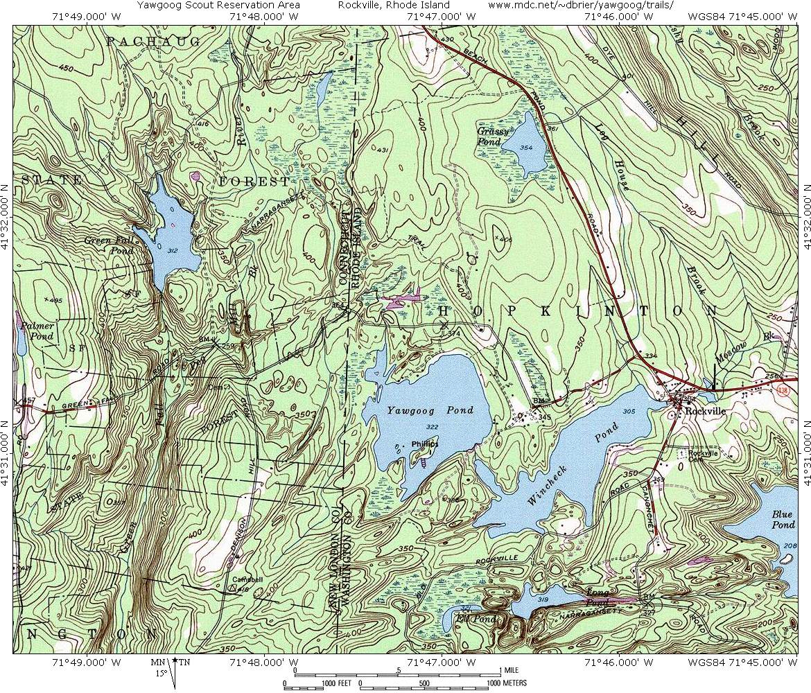
- A topographical map (of mediocre quality but illustrative nevertheless)
Challenger Disaster
The space shuttle Challenger exploded, 73 seconds after launch, on January 28, 1986, killing the seven astronauts on board.
The shuttle failed because two rubber O-rings leaked fuel.
The O-rings lost their resiliency because the ambient temperature was very low.
Before the flight, engineers knew of the problems of O-ring damage with low ambient temperatures and recommended that the shuttle not be launched.
Was the information presented in a way that did not make the engineers claims clear?
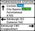
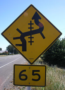
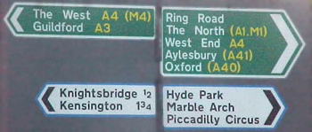
Road and Transport Signage
Comparison of different signage systems.
Swatch Watch
Design style outweighs utility and functionality. A multitude of designs allows personalization for the buyer. The same methodology has been applied to a number of consumer products. (Swatch website)
Air Traffic Control System
Original design used a single colour vector display.
Extensive colour research allowed designers to come up with a perceptually-based system to help ease fatigue and draw operators' attention to critical data.
Do a web search to find out what these displays look like. Here is good example.
Web Examples
Crime MappingThinkmap web site (Java)
Fuse98 web site (DHTML)
History Flow (WIKI / Wikipedia content diagram)
Presenting information in ways that reveals the information content clearly and encourages analysis can have often critical advantages for multimedia design.
CSE3325 courseware | CSE3325 lecture notes
![]()
©Copyright Alan Dorin 2005