Clarity and excellence in thinking ![]() Clarity and excellence in data
Clarity and excellence in data
Lecture : Information Design
In the previous lecture:
In this lecture:
Additional References:
Clarity and excellence in thinking
|
What is Information Design?
Presenting information about motion, process, mechanism, cause and effect.
How do we present information that is... ?
 |
|
|
The aim is to induce the viewer to think about substance over methodology, graphic design and technology. The graphics should reveal information (not obscure it). |
||
Graphing Data
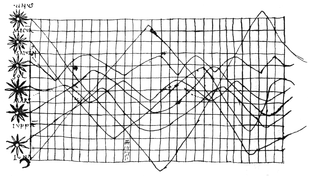 |
A tenth century graph. Is this the first ever graph? from H Gray Funkhauser, "A note on a tenth century graph", Osiris 1 (1936), 260-262, reproduced on p.28 of E R Tufte, The Visual Display of Quantitative Information, Cheshire, CT: Graphics Press 1983 |
 |
Graphs use abstract, non-representational pictures to show numbers. Statistical graphs were invented around 1750-1800. Graphs allow us to reason about quantitative data. (They can also be misused.) |
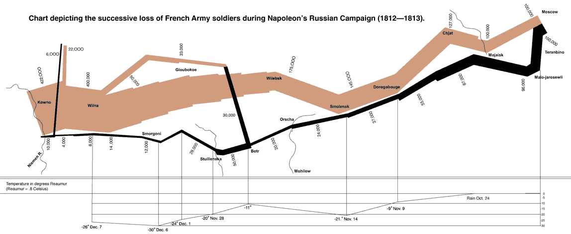 |
An excellent chart by Minard (1869) shows the relationship between the size of Napoleon's army as it marched on Russia in 1812, the obstacles it was forced to overcome and the times, places and success with which these obstacles were met. |
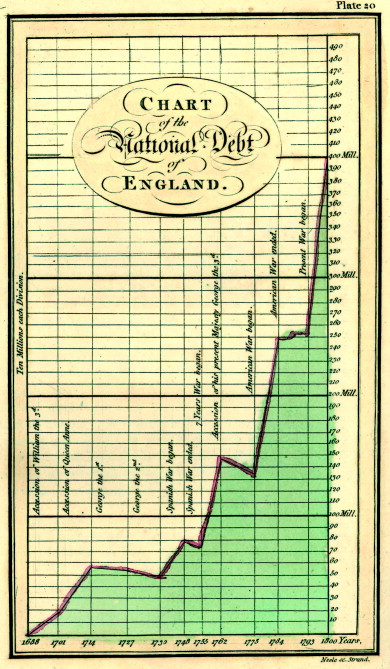
| Some tips on the creation of clear graphs. | ||||
 |
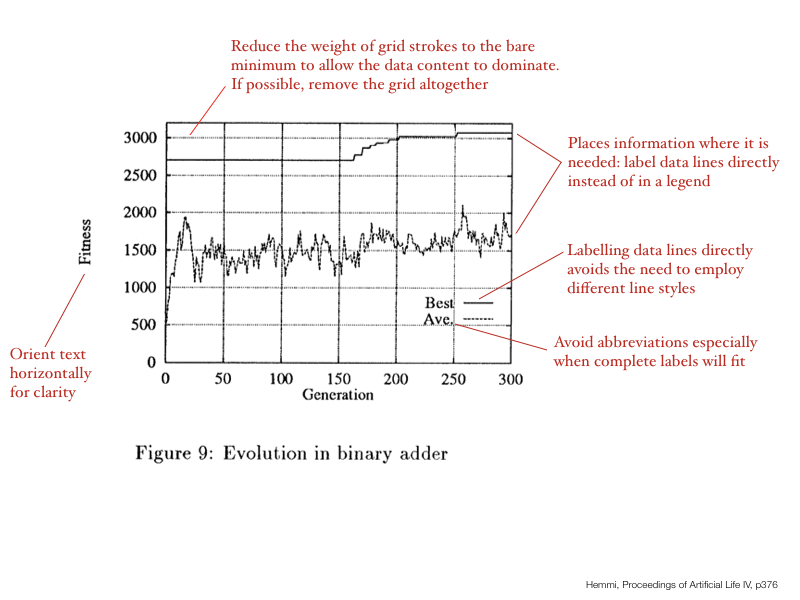 |
 |
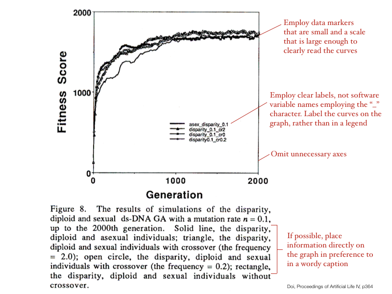 |
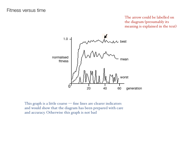 |
A Graphing Example: Space Shuttle Challenger Disaster
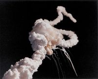 |
The space shuttle Challenger exploded, 73 seconds after launch, on January 28, 1986, killing the seven astronauts on board. The shuttle failed because two rubber O-rings leaked fuel. The O-rings lost their resiliency because the ambient temperature was very low. Before the flight, engineers knew of the problems of O-ring damage with low ambient temperatures and recommended that the shuttle not be launched. So why did the flight go ahead? |
Image © Copyright NASA |
|
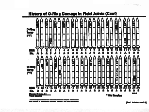 |
Instead of documenting the history of failed O-rings using a simple and effective graph, the information was presented as it appears at left: as a sequence of little rocket drawings, with a complex legend of shading, and numbers scattered around on the rocket bodies indicating failed O-rings and launch temperature. As an example, the information designer Tufte redrew this information in a much simpler form clarifying the relationship between launch temperature and O-ring failure and omitting irrelevant information such as the order in which the failures occurred. You can have a look at the result online. |
Image from asktog - an excellent site on interaction design |
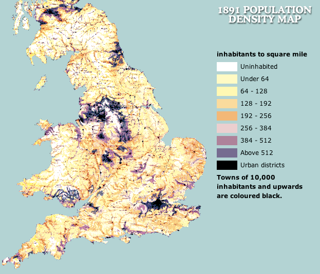
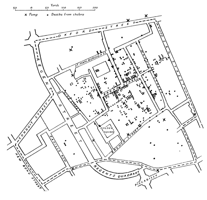
Cartography
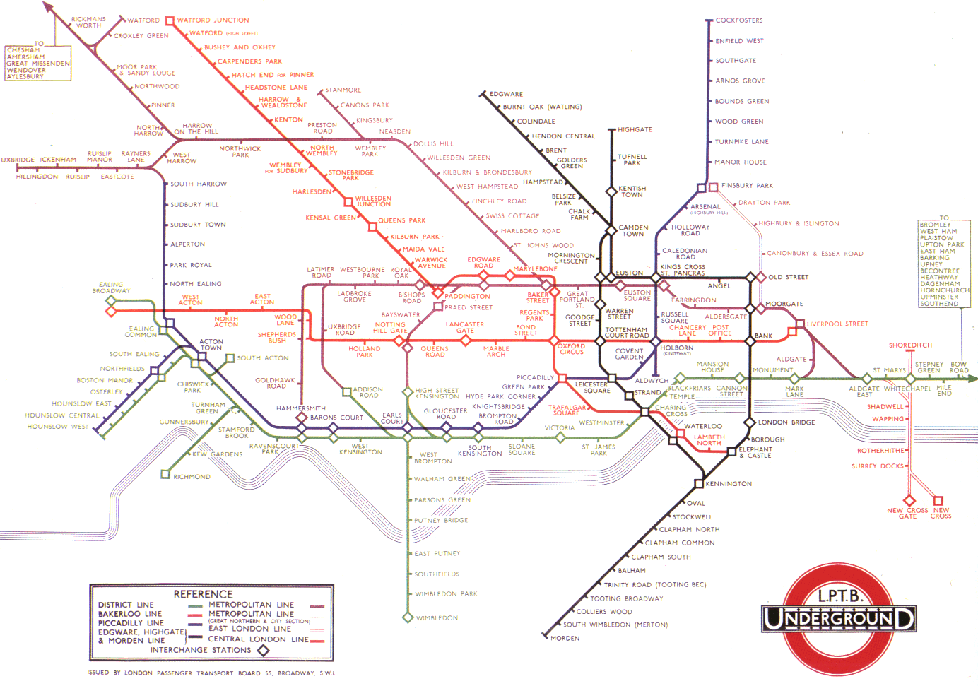 |
London Underground map, designed by Harry Beck in 1933 achieves a reduction of complexity through:
|
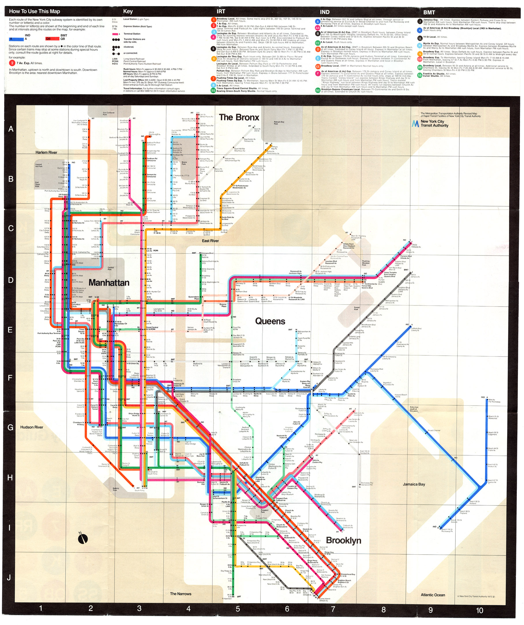 |
New York City Subway map (1972, 1977-1978, 1979 onwards).
|
 |
Of course mapping is a fantastic information display mode in many contexts.
|
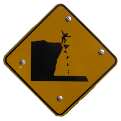
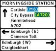
Road Signage
 |
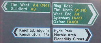 |
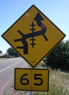 |
What are the major considerations in the design of road signs? How are these met in the examples above?
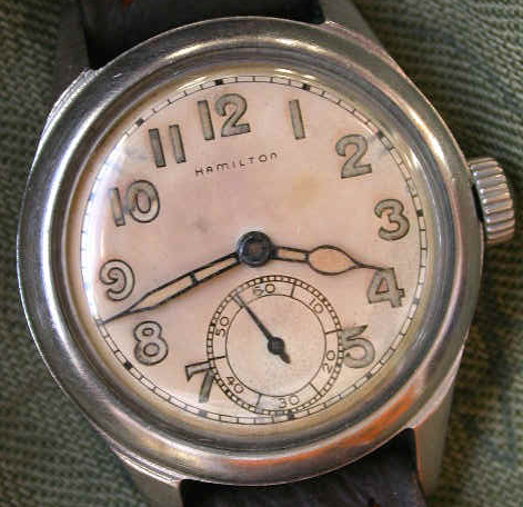
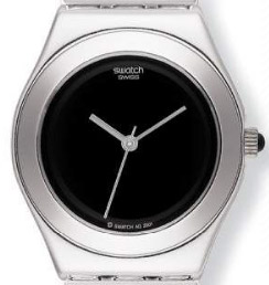
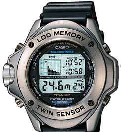
Watch and Clock Design
The wrist-watch is available in an abundance of designs.
 |
 |
 |
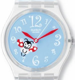 |
| What design features does a clear watch face possess? | |||
| Sometimes design style outweighs utility and functionality... a multitude of designs allows personalization for the buyer. The same approach to design has been applied to a number of consumer products. | |||
Air Traffic Control System
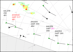 |
Original design used a single colour vector display. Extensive colour research allowed designers to come up with a perceptually-based system to help ease fatigue and draw operators' attention to critical data. Do a web search to find out what these displays look like. Here is good example. How do the principles of interface design (presented at the end of the previous lecture) impact on the design of these displays? |
 |
A few examples for you to investigate...
History Flow (WIKI / Wikipedia content diagram)