 |
 |
 |
 |
Spherical compass |
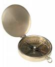
Pocket compass (antique) |
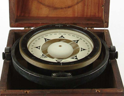
Gimbled Ship's Compass (antique) |
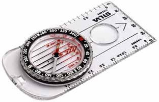
Silva orienteering compass |
Lecture : More Human-Computer Interaction
In the previous lecture:
In this lecture:
References:
Norman, D. The Design of Everyday Things, Doubleday, New York, 1990 (and other books on design).
Why are so many of our artefacts so difficult to use? ...because they have been poorly designed! This is not good enough!
Objects that "work" offer a psychology of use that is intuitive and "natural".
Good design defuses the tension between functional and aesthetic goals.
 |
 |
 |
 |
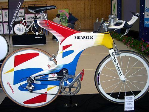
Pinarello time-trial bicycle |
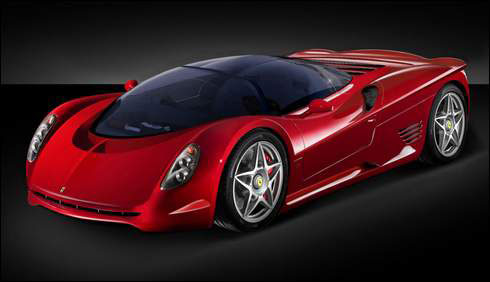
Ferrari |
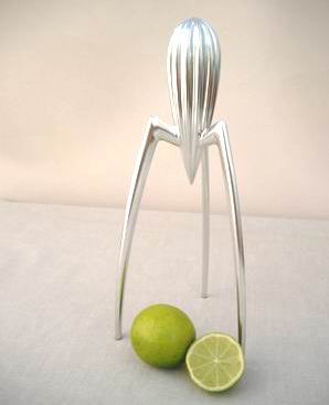
Alessi juicer (by Philippe Starck) |
Waterman fountain pen |
Some companies (such as Ferrari, Pinarello, Waterman & Alessi) are famous for their designs.
In any real-life situation there are always competing pressures of cost, quality and production time.
Cognitive Engineering (...engineering the way people think)
|
Balls - throwing Knobs - turning Handles - grasping |
Glass - looking through (or breaking) Paper (and toilet doors) - writing on |
 |
|
Finger holes in scissors Push-plates on a door Non-square shape of 3.5" floppy diskettes |
Functions on a digital watch Operations entered on a command-line UNIX interface |
The more possible interpretations a thing has, the more difficult it will be to use.
Mappings (in general) are relationships between things.
In terms of design, mapping might be between controls, their movements, and the result of the operation on/in the world.
Natural mapping leads to immediate understanding because it takes advantage of physical analogies (folk physics) and cultural standards: a close and natural relationship between control and function.
Physical Analogy
A car steering wheel - the direction the driver turns the wheel top matches the direction the car steers.
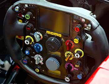
A formula-1 car steering wheel. Is this intuitive? (http://www.f1technical.net/article30.html) How does this device make affordances visible to the driver?
An aeroplane joystick - pushing it forward (away from the pilot) drops the nose of the aeroplane (away from the pilot).
The joystick (front/bottom and left of center) is just one of many visible controls. A pilot does not have time to cycle through a series of menus to locate various functions of his control. (http://staff.tay.ac.uk/bstmjc/mjc_research1.htm)
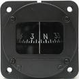
Cultural standard
Rising level - indicates 'more' of something and vice versa, as does an increase in numeric value and, in Western (English speaking) culture, left to right.
Light switch position - up indicates 'off', down indicates 'on' (in Australia)
What might an increase in pitch (of an audio tone) indicate?
Conceptual Models
- People will always make mistakes (too err is human…)
- Bad design blames the user for incorrect operation
- Complex systems still need to be learned
- People's understanding of the world is not, in general, the same as that of ‘experts’
- Refusing to believe the evidence — instruments indicate that something is wrong — is something really wrong or are the instruments wrong?
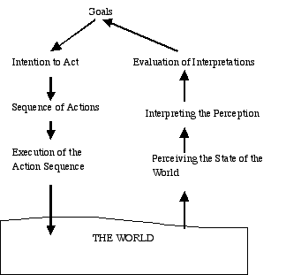
The action cycle: execution and evaluation
Some design questions
How easily can a user...
...determine the function of the device?
...tell what actions are possible?
...tell if the system is in the desired state?
...determine mapping from intention to physical movement?
...determine mapping from system state to interpretation?
...perform the action?
...tell what state the system is in?
Knowledge
Much knowledge is "in the world" not "in the head". Most of our "in the head" knowledge is vague and imprecise. (e.g. try to remember the layout of the QWERTY keyboard).
Information a person needs to perform a task: put as much in the world as possible. Use physical and cultural constraints.
Types of knowledge:
Knowledge in the world:
Knowledge in the head:
Applications of cognitive engineering to multimedia and user-interface design
Visibility: make the functions clear. Differentiate opposing functionality. Use visual function to confirm the user's mental model of operation. Sometimes sound can be used to make things ‘visible’ (E.g. A vacuum cleaner clogging up can be audibly detected).
Feedback: give actions immediate feedback, to reinforce the user's mental model.
Design for error: people make mistakes for many reasons. Good design accepts mistakes as a normal part of operation and accommodates them.
• Try to minimize the causes of errors by understanding them.
• Make actions reversible (undo).
• Make it easy to discover when errors do occur and make them easy to correct.
• Think of "actions as approximations of what is desired", as opposed to "user errors".
Forcing functions: provide constraints of operation in certain situations.
 |
Metaphors "In theory, an interface designer adopts a metaphor as a means of making the application easier to learn. This theory is based on the premise that the user will be able to transfer his or her knowledge of a familiar object structure to the new application. In practice however, an interface designer often adopts a metaphor as a means of expressing his or her model of how the system is organized. That the metaphor might make the application easier to use is often an after-the-fact and unsubstantiated rationalization of the design." (Interface Hall of Shame) |
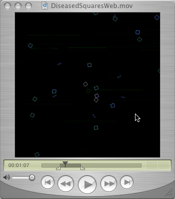
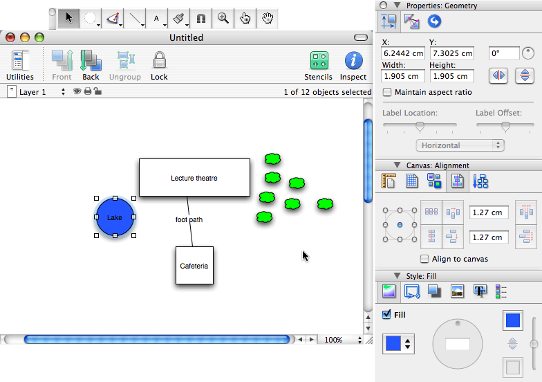
| Homework: | Have a look at the two images of graphical user interfaces below. Carefully assess them for their designers' use of the principles covered in this lecture. Choose some software on your own computer and give it the "once over" to see how well its designers considered these same principles. |
 |
 |
Apple Quicktime movie player interface |
Omni Group Omnigraffle drawing package interface |
Summary: