FIT3084: Site
Design
In the previous lecture:
- Labels may be textual or iconic but they should always be clear and assist
the user in moving through a body of information.
In this lecture:
- Designing a website is an on-going process
- At every stage ensure that you employ user-centred design for all aspects
of your site
|
|
|
The web design algorithm...
|
- Plan
- Plan
- Plan
- Plan
- Plan
- Plan
- Plan
- Execute
- Test
- Goto step
1
|
...an infinite loop!
|
|
References
- Lynch, P.J., Horton, S. "Web Style Guide", Yale Univeristy Press,
1999, Chpt 1,2,3
- Rosenfeld, L., Morville, P. "Information Architecture for the World
Wide Web", O'Reilly, 1998, Chpt 7,8
Q:
What is good design?
A: It depends on the goal! A goal must be
set before all else!
A well designed artefact elegantly satisfies the needs of its user... this
is user-centred design.
User centred design applies to all aspects of presenting information.

|
eg. VW and Ferrari design excellent cars but neither would satisfy the
design brief of the other!
A Combi-wagon would not be a good racing car, nor would a Ferrari be
of much use as transport for a hippy commune!
|
A Sample Web Site Design Brief
Identify (for the site) the
Goals & Messages
- Primary & secondary goals
- Short term & long term goals
- Put goals in writing
- Have client & site creators sign goals
- Primary & secondary audiences - Who are they? What do they want from
the site?
- Age, interests, culture / sub-culture, computer literacy...
- Audience hardware / software capabilities
- Platform, browser, monitor, connection speed...
- What message(s) must the site convey to the target audience to meet
the goals?
Content
- Does the site require new content creation?
- If no:
Where is the content coming from?
How will it be altered to fit the new medium?
- If yes:
How will the content be created / collected?
- How does content enable site to meet its goals & convey its message?
Structure
- How will the content be organized?
- How will the organization enable the site to meet its goals & convey
its message?
- What options need to be available for viewing / searching the site contents?
Sensorial Design
- What will be the 'look and feel' of the site?
- How will look and feel enable the site to meet its goals & convey
its message?
- What visual, auditory, textual & interactive elements will be required?
- What tools / hardware / software / programming skills are required to
create this content?
Market Testing
- Who are the competitors for this site?
- What are their strengths & weaknesses?
- How can these be exploited?
- What niches are yet to be filled?
Team
- Who are the members of the production team?
- What are their roles and responsibilities?
- What is their experience (is it sufficient)?
Additional Things To Consider (to
please me)
- Fast download!
Web surfers like me are (very) impatient.
- Simple
Surfers, including me, are lazy and stupid!
- Clear
Surfers are (mostly) not cryptographers or linguists.
- Attractive
(snazzy, sombre, subdued, corporate, elegant, trendy, slick, subtle, dark,
light, playful...)
Web surfers are into things that look cool.
- Compelling
Surfers are fickle.
- Idiosyncratic
Surfers see hundreds of sites that look the same.
- There's lots to consider!
|
|
|
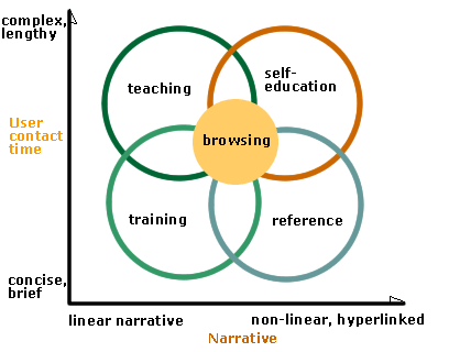
Four major themes of information delivery (Lynch &
Horton, "Web Style Guide", pp31)
|
Common Site Elements
- Home/Main pages
- Menus and Subsites
- Resource Lists, "Related Sites" pages
- Tables of Contents, Site Indexes and Maps
- Search Features
- "What's New?" pages
- Contact Information and User Feedback
- FAQ's
- Custom error pages
Information Architecture
What content will appear on what page?
How will the web documents be linked?
Depict the result in a branching diagram...
Will you employ a hierarchy, linear sequence, a grid or a combination of structures?
Refer to the lecture on Information Architecture for
details.
Page Architecture
- What navigation system will be used?
- How will each page look?
- Choose colours, fonts and other layout elements if not already specified.
- How will these sit together?
- How will all this maintain the site 'look and feel'?
- Sketch many alternative layouts and refine them.
(Use a pencil for Heaven's sake!)
- How will the page architecture enable the site to meet its goals and convey
its message?
....only now is it time to sit down and enter HTML!
A Vital Note On Copyright
- DO NOT use any material (images, text, programs or anything else)
on your web page from any source unless you have explicit, written permission
from the author to do so....
- This means for example that you may:
NOT scan in, nor copy images already on the web, for inclusion in your
own web pages,
NOT even if you alter them in some way yourself,
NOT even if they are supposedly public domain.
NOT hyper-link to an image created by another person to include it
in your own web page.
(You may link to the entire web page in which the image originally appears
however.)
- It is better from a copyright standpoint (also from the standpoint of interesting
web design) to create all your own imagery.
- Quotations taken from published sources must be clearly and fully referenced
immediately following the cited text.
(Not buried somewhere on a separate page.)
- Explicitly protect your work by placing a copyright notice on your homepage.
- An example copyright case.
- An example of why using clip-art may have
undesirable side-effects.
This lecture's key point(s):
- Ensure everything is spelled out in writing and agreed upon before you
start coding HTML
- In particular, determine your audience and their requirements to establish
the goals for a site
Courseware | Lecture notes

©Copyright
Alan Dorin 2008
