FIT3084: Navigation
In the previous lecture:
- Organization schemes - determine how to subdivide/classify large
amounts of information.
- Organization structures - determine how to arrange sections of
related information.
- Appropriate organization schemes and structures are determined by a user's
needs, those of the owner of the information and the kind of information
being presented.
In this lecture:
- What features of the browser assist in navigation through a site?
- How can you ensure users know where they are within a site?
- What tools are available to assist a user to navigate around a site?
Browser Navigation Features
- Open URL - access a specified URL by typing it in
- Back/Forward buttons - incremental tracking through previously visited
locations
- History list - random access of previously visited locations
- Bookmark - store a location for later return
- Hyperlink colour - purple (or
dark) for visited, blue (or bright) for
unvisited, underlined for a link
- Status bar - shows destination of a link (e.g. Is it on the current
server, in the current country?)
These features have been carefully researched!
Make the most of them.
Avoid corrupting or over-riding them for aesthetic or other reasons.
Building Context
|
|
Ensure the user always knows their location including:
- Which site they are looking at
- Where in the site they are located
You can use page headers & footers, the page title and consistent sensorial design to achieve these goals.
The site navigation system should consistently present the paths which
may be taken and indicate the current location in the site.
|
|
Book 7
The Story of Medea and Jason
|
The Argonauts now stemm'd the foaming tide,
And to Arcadia's shore their course apply'd;
Where sightless Phineus spent his age in grief,
But Boreas' sons engage in his relief;
And those unwelcome guests, the odious race
Of Harpyes, from the monarch's table chase. |
|
214
|
|
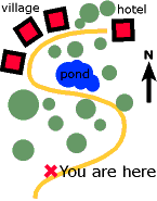
What features does a map have to assist the reader in this regard?
What navigation features does an ordinary novel have to do the same?
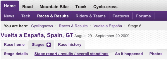
| A breadcrumb trail and highlighted navigation icons can show users their current location. |
|
 |
Apple website breadcrumbs and navigation bar. |
| |
|
 |
CyclingNews website breadcrumbs and navigation bars. |
Types of Navigation System
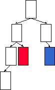
Hierarchical Navigation Systems
The information hierarchy (see the lecture on Site Design)
is usually the primary way of moving through data.
It can also be restricting...
|

|
 |
|
How would you move through this hierarchy from the red cell to the blue
cell?
|
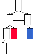
Use the benefits of hypertext but be wary of adding too much complexity.
|
Global Navigation Systems
These allow movement to locations which may otherwise require several
jumps in the hierarchy.
Appropriate destinations are context dependent.
A simple example which often appears on a page footer...

What might the shades of this footer's icons indicate?

What about this one?

Local Navigation Systems
Sometimes an area within a large site (or other data collection)
may be viewed as a sub-site.
(E.g. the purchasing section of an online shop, the lecture
notes on the CEMA site)
Local navigation systems can be introduced to navigate within
sub-sites.
Local navigation systems should complement (not replace) the global
navigation system for the site.
|
Bill's e-Boutique*
|
|
Place your order...
|
|
|
*e-Boutique is not a registered trademark of
e-Monash
Ad Hoc Navigation Systems
The in-line hyperlinks within the text here are examples
of an ad hoc navigation system. These links are easily
missed by users and so should be included with care. Don't
bury vital links like this within slabs/sentences of text
as they will often go unnoticed making your website frustrating to move through.
Nevertheless, embedded links are indeed elegant and may be used for non-essential
information or when you are certain that they will only be of relevance to people
reading the text.
Sometimes making a list of links to replace or complement embedded hyperlinks
may be beneficial...
Navigation bars
- Why must you be especially certain to include sensible ALT
values for images in a tabulated navigation bar?
- What can you do about providing similar navigation options if you employ
an image map?
- What are the advantages of the plain hyperlink navigation bar over the other
two styles?
- Which of the styles is least flexible when the site content changes?
|
What are the drawbacks of this navigation bar?
|
|
|
...and the advantages of this one?
|
|
Frames and Navigation Bars
- Hyperlinks within one pane can control the content displayed in another
pane within the same window.
- Navigation bar remains constant throughout the navigation experience.
- Frame / navigation bar cannot be scrolled easily out of sight, consuming
valuable screen real-estate.
- Violate the 'page model' of the web.
Take care!
Pull Down Menus
- Compact way of presenting options
- User has to operate menu to see options
- Variations on this idea are possible too... Adobe
The Table of Contents
A hierarchical list of major topics and sub-topics (useful if the website is
hierarchical in form).
Should re-inforce (not conflict with) the information hierarchy.
Facilitate fast, direct access for users who know what they are looking for.
The Index
An alphabetical list of keywords and phrases from a site.
Useful for sites which aren't hierarchical (index is usually relatively flat).
Ensure keywords are selected to assist a user in their queries.
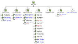
The Site Map
A geographical representation of the information on a site.
Guided Tour
What are the advantages of a guided tour for assisting a new user?
How would you implement a guided tour of a web site?
What kind of navigation system would you employ?
This lecture's key point(s):
- Many systems may be used to assist a user to navigate around a web site.
- Ensure the user always knows where they are, where they can go, and where
they can locate the information they require.
Courseware | Lecture notes
©Copyright
Alan Dorin 2009
