FIT5900 : Typography
In the previous lecture:
{Previous lecture summary or topics}
In this lecture:
...the art of printing, particularly those branches of it concerned with the design, setting, and arrangement of type.
...the making of impressed copies from the inked surface either of an engraved block or metal plate, of a lithograph, or of movable type...
Technology has changed, but the need to master type remains!
Face / typeface / font:
a set of characters
(letters, punctuation marks, numbers and assorted textual symbols such as @#$%)
Family: a group of typefaces sharing common features.
The two most common families of type:
|
|
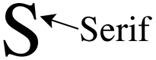
The serifs are the little marks at the ends of the sweep of the lefthand S.
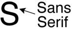
'Sans' is French for without, so it's no surprise that a Sans
Serif font is a font without serifs!
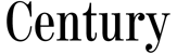
Some Serif typefaces...
| |
|
| |
|
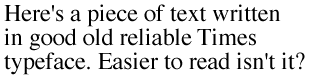
Serif fonts are frequently
elegant,
easy to read,
suitable for body text (look at the text in most novels).
Serif fonts have a formal quality about them.


Some Sans Serif typefaces...
| |
|
| |
|
Serif fonts are:
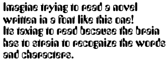
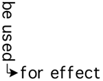
Decorative typefaces like these
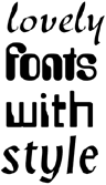
may be used to convey a mood or set a look and feel...
but should be used sparingly as they are hard to read in large quantities!
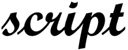
Script fonts emulate hand writing. The characters follow into one another.
|
works poorly in body text but, like decorative fonts, may work well in short sections, headers or on dance party & birthday invitations! |
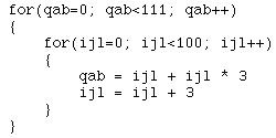
Monospaced faces such as Courier
allow the same amount of horizontal space for each letter.
For example, count the x's below (Courier
on the left, Helvetica on the
right)
Monospaced characters line up in columns which is vital in many circumstances!
|
|
Type Form, the shape and direction of a typeface.
Type Weight
Roman text - standard / medium weight font.

Bold text - provides emphasis, adds weight to a page by thickening the character strokes.

Light text - subtle and gentle characters produced with slender strokes.

Type Width
Condensed text - (compressed) less character width than Roman text of this style.

Expanded text - (extended) more character width than Roman text of this style.

(It is actually the letterforms which are altered in these types, not the spacing
between letters.)
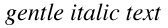
Italic text - slants fluidly to the right in the manner of handwriting.
Oblique text - slants rigidly to the right not in the manner of handwriting.
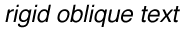
(The character's inclination might be the same, but the Sans Serif font looks
regimental whilst the Serif font flows like handwriting)
Is measured in points
There are 72 points to an inch (that's 2.54 cm)
Size of text should indicate its importance relative to other page elements.
Headings should be large.
Footnotes should be small.
And body text should be just so! (Usually around 12pt)
Be consistent with all your font decisions, including size!
Leading - distance between text lines.
Kerning - space adjustment between particular letters of a font which
otherwise appear too distant or too close to one another.
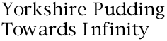
(E.g. Note the strange gaps between uppercase 'T' and lowercase 'o',
uppercase 'Y' and lower case 'o', uppercase 'I' and lowercase
'n'. Also note the irregular gaps between the lowercase 'w' and
the 'o' and 'a' on either side...)
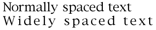
Spacing - horizontal space between all letters of a font.
Anti-aliasing is of benefit to smooth the jaggies around large characters...
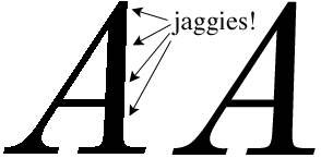
...but it can make small characters blurry and illegible...
So, how do you do this in a web page?
![]()
This will depend on the family from which they spring, their orientation, position, relative size and weight and a host of other characteristics, all of which need to be understood to enable the message contributed by the fonts to meet the goals of the production within which they appear.
FIT5900 courseware | FIT5900 lecture notes
![]()
©Copyright Alan Dorin & Jon McCormack 1999,2000