FIT5900
: Activity, Colour Theory
Optional Activity (not assessed)
- Unfortunately, monitors vary from manufacturer, nevertheless, the following
exercises will help introduce you to colour and its use.
- Be sure to have your monitor brightness and contrast both fully on (high) so that white
appears WHITE and black is BLACK.
- All colours used in these exercises must be pure and fully saturated unless
otherwise requested. Eg. blue has R=0.0, G=0.0, B=1.0.
- Ensure your monitor is displaying millions of colours (16 or 24 bit) if
possible (ie. not 256 colours / 8 bit).
- Make sure you do these exercises yourself, don't rely on the pictures on
this page or the things your friends tell you. (The images on this page are
too small for the relevant effects to be visible and serve only as examples.)
Knowledge comes from experience! You'll learn only by doing.)
- Refer to: Itten, J. "The Art of Colour", for the book on colour theory.
Colour effects
- Run your paint program (Corel Draw, Paint Shop Pro, Photoshop) and
open up a new picture with dimensions so as to fill the whole screen.
- Fill the blank image with a pure/neutral grey (50%). (This provides a neutral
background environment for un-biased colour viewing.)
- Draw a white square in the left half of the grey field.
- Draw a black square (of the same size) in the right half of the grey
field.
- Draw a pure yellow square in the centre of each black/white square. How
does the character of yellow change when centered in black / white? (I.e.
Do the two yellow squares look the same? How are they different? Try to put
into words what you see.)
- Draw a pure blue square in the centre of each black/white square. How does
the character of blue change when centered in black / white?
- Draw a pure red square in the centre of each black/white square. How does
the character of red change when centered in black / white?
- Draw a pure green square in the centre of each black/white square. How does
the character of green change when centered in black / white?
- Consider the manner in which yellow is made on a display using additive
colour. Is it a primary colour? What are the additive primaries?
- Consider the way green is made using paint. Is it a primary colour? What
are the subtractive primaries?
-
Different colours have different light values.
This is a subjective measure of how bright a colour appears...
-
Create a new image of dimension large enough to fill the
screen and fill it with neutral grey as for the previous exercise.
-
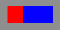
Draw a rectangle in blue of width 400 pixels and height
200 pixels.
-
Draw a rectangle in red, starting from the left of the image
extending some width across the blue rectangle until the blue and red seem
exactly balanced.
-
Experiment with different widths of red. What proportion
of red to blue did you settle on? What did your friends settle on? Were
your results similar?

-
Now try the same exercise with blue and yellow.
-
Are the proportions the same?
-
Experiment with different colour combinations.
-
Try and come up with a relative 'lightness' for each of
red, green, blue and yellow. This lightness value is a relative value indicating
how strongly the colour pulls your attention.
-
For example, if you found that 2 parts red balanced 4 parts
blue and 4 parts blue balanced 1 part yellow, your lightness values would
look like this...
2-Red : 4-Blue : 1-Yellow
and you could expect that 2 parts red would balance 1 part yellow. Test
your results!
-
What happens if you reduce the saturation of one of the
colours in a previously balanced image? Which colours are most susceptible
to decreases in saturation? Which colours are least susceptible?

Here are a few sites to look at:
What do you think about the choice of colours? Appropriate? Attractive? Clear?
Have the webmasters considered colour meanings, effects and relationships?
Do the typographical decisions make the pages easier to scan or read?
Is the page layout appropriate?
Is a clear visual hierarchy established?
Discuss your thoughts with your classmates.