Usually the eye catches elements in this order:
- large shapes and blocks of colour (images etc.)
- graphics content
- major heading content
- minor heading content
- sections of body text
This is a visual hierarchy!

CSE3325: Page
Design
In the previous lecture:
In this lecture:
The moment you've all been waiting for... time to design a web page!
Layout of a web page is not that different to layout of printed
matter.
(But obviously there are additional aspects to be considered.)
|
"We seek clarity, order, and trustworthiness in
information sources,
|
Visual Hierarchy
Create a strong and consistent visual hierarchy which leads the viewer's eye around a page.
Tools: layout, typography, illustration
Example: Consider a page of a magazine such as Cleo
What does your eye focus on first? Second? Third? Fourth?
|
Usually the eye catches elements in this order:
This is a visual hierarchy! |
|
(We can study the way the eye moves over a printed page in order to learn about how people process graphical and textual information.)
Importance of Contrast
Contrast is used to assist in achieving these broad goals for layout and composition...
Balance
(Left and right, top and bottom, front and back)
Gridding
(Elements should line up)
Proportion
(Certain ratios are more pleasing than others)
|
Square |
1:1 |
 |
|
Square
root
|
1:1.414
|
 |
|
Golden
Rectangle
|
1:1.618
|
 |
|
Double
Square
|
1:2
|
 |
An example...
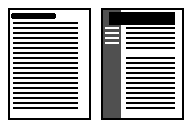 |
Which page design is preferable? Why? Where does the eye focus? How is the visual hierarchy established? |
Consistency
Choose a layout style for your pages and apply it across your site
Choose a graphical style for your pages and apply it across your site
Page Dimensions
Computer screens are small and of low-resolution compared to print media.
Computer screens are cluttered with browser borders, menu bars, control strips, scroll bars.
The smallest common monitor size is 640x480 pixels.
Don't design your pages to depend on monitor sizes larger than this!
Be aware that people may want to print your web pages onto A4 paper - especially if they contain lots of text!
|
Graphic Safe dimensions for printing |
width=535 pixels |
|
Graphic Safe dimensions for screen-only use |
width=595 pixels |
Page Length
Pay great attention to page content which appears "above the fold".
What does this mean? Why is this necessary?
But a user can scroll can't they?
Avoid scrolling if possible!
The proper page length to employ will depend on:
Minimize the damage of long pages by:
|
Shorter web pages are good for:
|
Longer web pages are good for:
|
Web pages must be free-standing
Pages may be accessed at random so each page needs to make sense on its own.
Every web page needs to answer the following basic questions:
Page Headers & Footers
Page headers and footers may help the user by:
...yes, page headers and footers are an excellent means of providing consistency!
(Make these clear, but not so large that they dominate or waste precious screen real-estate)
HTML assistance
HTML is not really suitable for complex page layout tasks.
CSE3325 courseware | CSE3325 lecture notes
![]()
©Copyright Alan Dorin 2005