What is colour? 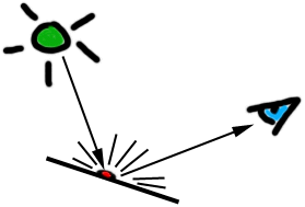
The wavelength of light hitting the retina determines the cones (structures in the eye responsible for colour vision) that will be stimulated and the messages which will be sent to the brain. The result... we see colour!
Lecture : Colour
In the previous lecture:
In this lecture:
Additional References:
What is colour? The wavelength of light hitting the retina determines the cones (structures in the eye responsible for colour vision) that will be stimulated and the messages which will be sent to the brain. The result... we see colour! |
Subtractive Colour
|
Materials can contain pigments that...
...light! |
 |
Paints & dyes are pigments in convenient, human useable form. We apply them to surfaces or materials to change the colour of the light they reflect or transmit. (We can't see the light that is absorbed.)
|
Subtractive primary colours are the basis for all other colours. Since kindergarten you've been told these are: Red Yellow Blue |
Secondary colours are constructed by combining equal proportions of primary colour. Orange......Red + Yellow Purple........Red + Blue Green.........Yellow + Blue |
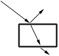
Subtractive - pigments filter out light of different wavelengths from white light, leaving coloured light to be detected by our retina.
Eg. A white page of paper appears (and is called) white because it is reflecting all wavelengths of visible light incident upon it.
If we were to apply blue ink to a white page, light hitting it would be filtered by the pigment in the ink (which only transmits blue light). This blue light would hit the white page, be reflected back through the ink (where it is filtered again) and may hit a person's retina. That person may well exclaim "Blue!".
| Homework: | What primary colours are used for printing purposes? Inspect a coloured newspaper page with a magnifying glass to find out. |
|
Subtractive Colour Wheel - a diagramatic representation of the relationships between colours. The primary colours form the vertices of a triangle around the circumference of the wheel. Secondary colours fit between these, tertiary colours flesh out the circumference to any resolution you please. |
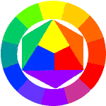 |
Intermediate colours are constructed by combining two primaries in a ratio of 2:1.
(These colours lie between the primary and secondary colours on a colour wheel)
Tertiary colours are combinations of the primary colours in any other proportion.
Tints & Shades are series of colours obtained by adding white (for tints) or black (for shades) to a colour obtained above.
If you really want to understand what these terms mean, there is no substitute for buying some white, black, red, blue and yellow paint and some white paper... get your fingers dirty. This will give you a better understanding of colour than learning these notes ever will!
Computer displays add light to black (as opposed to subtracting colour from white).
Three guns in a Cathode Ray Tube (CRT) illuminate the screen in a closely spaced grid of tiny dots (pixels).
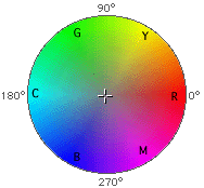
There is one gun for each of the additive primary colours...
|
Additive Primary colours Red Green Blue |
Additive Secondary colours Yellow...... Red + Green Magenta.... Red + Blue Cyan......... Green + Blue |
|
Additive Colour Wheel - a diagramatic representation of the relationships between colours. The primary colours still form the vertices of a triangle around the circumference of the wheel. The secondary colours sit between these and the rest are tertiary colours.
|
 |
Additive colours may be specified in software (since they are commonly used for digital colour specification) by giving intensity values for each of the Red, Green and Blue components at a single pixel.
The intensity of each colour may range from 0.0 to 1.0 (floating point representation) or 0 to 255 (eight-bit integer representation.
| Colour | RGB float | RGB integer | |
| Red | 1.0, 0.0, 0.0 | 255, 0, 0 | |
| White | 1.0, 1.0, 1.0 | 255, 255, 255 | |
| Mid-Grey | 0.5, 0.5, 0.5 | 127, 127, 127 | |
| Purple | ?, ?, ? | ?, ?, ? | |
| Brown | ?, ?, ? | ?, ?, ? | |
Some colours are easily converted into integer or floating point RGB specifications in one's head. Others are more difficult. What are the RGB values of the last two colours in the table above? Its not obvious, is it?
Usually software will incorporate a "colour picker" to allow users to specify colours by selecting them from a palette rather than relying on the user to calculate the RGB values in their head.
 |
 |
 |
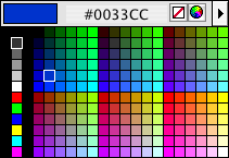
Macromedia Dreamweaver HTML colour picker (RGB values specified in hexadecimal) |
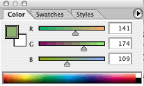
Adobe Photoshop colour picker |
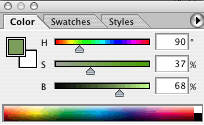
Adobe Photoshop colour picker (HSB values specified as an angle and two percentages) |
Hue, Saturation & Value (HSV / HSB)
A more intuitive means of specifying a colour than entering RGB values is to choose a hue, saturation and brightness...
|
Hue is the 'colour' of a colour, i.e. that which allows you to identify it generally as a 'blue' or a 'red'. Hues are often referred to by an angle on the colour wheel. (See the additive colour wheel image above and the Photoshop HSB colour picker). |
|
Saturation is the '-ness' of a colour, for example its 'blue-ness' or 'red-ness', also loosely called intensity. (A more saturated red is a more intense red) |
|
|
Value is the amount of light or dark in a colour. Sometimes this property is also called 'Brightness'. |
Colour relationships
...what is the colour complementary to blue? Does it matter whether you use the additive or subtractive colour system?
Groups of colours relate differently to one another depending on their properties.
|
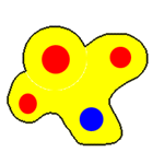
Discordant colours 'jar'. |
What colour is a...
Would you step on a grey bee? |
Have you ever seen a black and yellow elephant? |
|
Harmonious colours 'relax'. (Especially if they are not highly saturated) Imagine a dentist's waiting room painted black and yellow! |
|
 |
Colours can look energetic and busy, or calm and easy going. |
 |
Colour has subtle effects on our perception of the world. Colour relationships can be used to encourage a viewer to feel uneasy or at ease, comfortable, disoriented or cramped.
|
Warm hues (yellow .. red) encourage viewers to feel heat or warmth. |
|
|
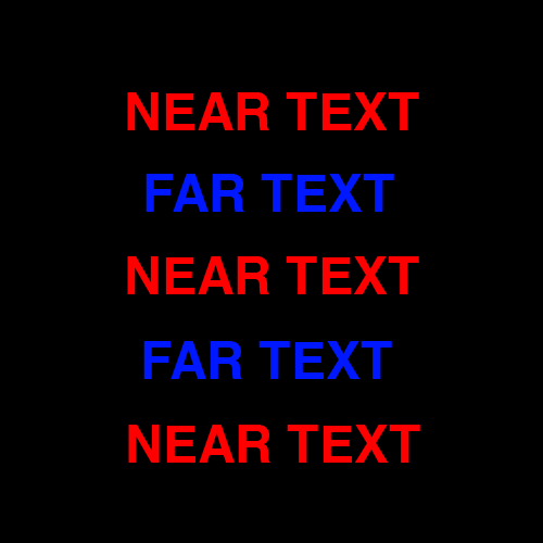
Warm hues move forward in a composition. |
|
|
Cool hues (blue .. green) encourage a cold or cool feeling. |
|
|
Cool hues sit backward in a composition. |
Here is an excellent illustration of colour depth effects... |
 |
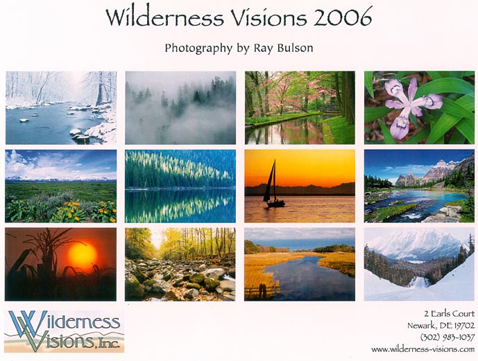
These calendar images illustrate a set of warm and cool hues. How would you organise the pictures over the year? |
 |
Colours have culturally-specific meanings.
 |
|
 |
||||||||
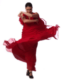
A red dress in China |
...is not... |
... a red dress in Spain. |
Colours may be associated with people and professions (often through trade clothing)
|
Spanish dancers, bull fighters? |
|
Soldiers, tram conductors |
|
Police, sailors, blue collar workers |
|
Bananas in Pyjamas? |
|
Clergy members, Suffragettes |
|
School teachers? |
|
Goths, motorcycle riders, artists, heavy metal heads |
|
Doctors, chemists, dentists, white collar workers, virgins |
There are many other considerations in choosing colour for your displays. We've discussed some of them in the elcture on Information Design. NASA has an interesting website on this very topic.